
Layout
A Layout is a custom-made panel (the Layout of grandMA): you place wherever you want fixtures, which show their color live, and show objects (groups, presets, views, Worlds, Faders, Buttons) which keep their look and their gestures. It is both a live lighting plot and a custom desk.
The Layout window is in the Display category. Layouts form a numbered pool, kept in the show.
The header
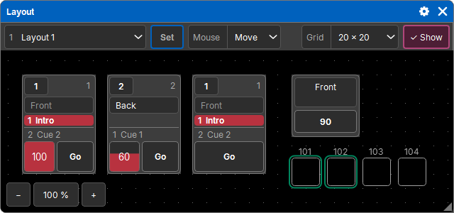
| Element | Role |
|---|---|
| layout list | the layout shown (number and name); then + New layout, Rename…, Delete… (on the one shown) |
| Set | on: you move and set up objects; off: you use the layout |
| Mouse | Move (a drag on the background moves the view) or Select (a drag draws a selection rectangle) |
| Grid | the grid step, from 0 × 0 (free placement) to 100 × 100 in steps of 10 |
| Show | shows or hides the grid dots |
+ New layout asks for 2D or 3D (see below). The layout shown, Set, the mouse mode and the grid display are window settings (kept in Views); the grid and the placed objects are in the show.
Zoom and panning
- In the bottom-left corner, − 100 % + zooms; a tap on the percentage goes back to 100 %, centered on the objects.
- Ctrl + wheel zooms around the mouse.
- On a touchscreen, two fingers pan and zoom the view, in all modes, without ever touching what is underneath.
- With the mouse in Move, a drag on the background pans the view.
The zoom and the area viewed are remembered by each layout: you find them again when you come back to it, in any window.
Placing fixtures
- Select fixtures in the programmer (by hand, with a group…).
- Store, then a tap on the layout background.
The fixtures are placed in selection order, starting from the tap, side by side in rows. A fixture with sub-fixtures (an LED bar, for example) gets its own row: its head first ("101", a tap selects the whole fixture), then its sub-fixtures in line (101.1, 101.2…).
Each fixture is a square with rounded corners:
- in the color it outputs, darkened according to its intensity, live (several colors, for example a two-color wheel: in stripes);
- its number above it;
- selected in the programmer: a frame in the programming color.
Placing objects
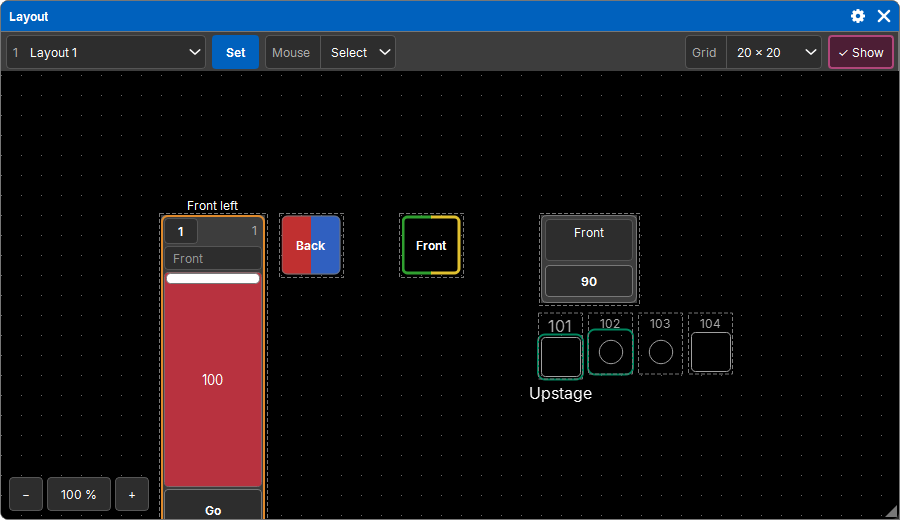
Assign, then an object (a group, a preset, a view, a World, a Fader, a Button), then a tap on the layout background: it is placed there, as it is in its window, with the same gestures. Several selected objects are placed at once, in rows.
A placed Fader or Button keeps its page: it does not follow the page shown in the Faders and Buttons windows.
Using the layout (Set off)
- Placed objects react as in their window: a group selects, a preset applies, a Fader slides…
- A tap on a fixture selects it in the programmer, or deselects it if it was selected. On the head of a fixture with sub-fixtures: the whole fixture.
- Mouse Select: a rectangle drawn on the background adds the fixtures it touches to the selection, in the order of the drawing (row by row, in the direction of the drag). Their place in the selection grid follows their arrangement in the layout: useful for effects and the Pattern.
- Off then a fixture: it leaves the programmer and the selection.
- Delete then a placed object: it is removed from the layout (the object itself, group or preset, stays in the show).
Arranging and setting up (Set on)
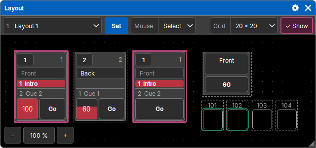
In Set mode, objects no longer react: you arrange them. They have an outline, solid and colored when they are selected.
- Dragging an object moves it, by grid steps, with the whole selection if it is part of it. Near the edge, the view scrolls toward it.
- Mouse Select: a rectangle on the background selects objects; a tap on an object selects or deselects it. Esc clears the selection.
- Long press on an object: its settings (below).
- Copy then an object (or the selection), then a tap on the background of a layout (the same or another one): the copies are placed there.
- Delete removes from the layout the object pressed, or the whole selection if it is part of it.
Position, size and arrangement
When objects are selected in Set mode, the Programmer window shows their settings instead of the families, in pages of tiles:
- X, Y (the top-left corner), Width, Height. A tile shows the value common to the objects (empty if they differ); a typed value goes to all of them; "100 thru 500" is spread in selection order;
- the Arrangement:
| Arrangement | Effect |
|---|---|
| Nothing | each object at its original place |
| Line | evenly spaced on a line of a given length and angle (0°: to the right, 90°: downward); its Origin says whether it starts from the objects' starting point, is centered on it or ends at it |
| Grid | row by row, a number of columns, a margin between cells |
| Circle | evenly on a circle of a given diameter, the first one at the top, turned by an angle |
| Rotation | the original places turned by an angle (clockwise), all together or fixture by fixture (a fixture and its sub-fixtures around their own point) |
The arrangement always starts again from the original places: Nothing puts them back. Each change is a history step.
The settings popup
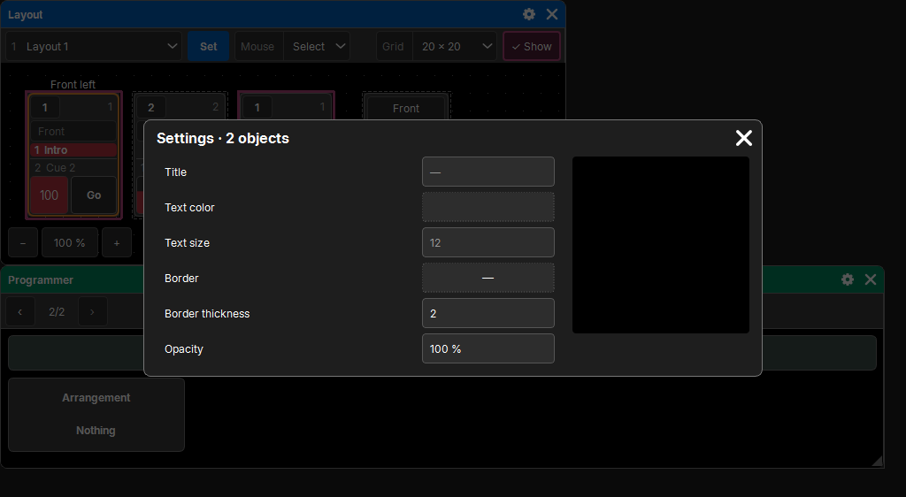
A long press on an object opens its settings (those of the whole selection if it is part of it). On the left, the categories; at the top right, a preview.
- General (any object): a title above the object (below it for a fixture), the text color and size (title and number of a fixture), the border color and thickness, the opacity.
- Appearance of fixtures: an image from the Images pool instead of the square (the frame takes its proportions), and the source that shows the color live: its shape (Rectangle or Circle) and its place as a % of the frame. You can also drag it and pull its corners in the preview.
- Appearance of Faders and Buttons: Normal (the slot of the Faders window), Large (number, name, a large fader with a handle and the button below), or Custom (a square, see below).
A field showing "—" has different values depending on the objects; a value given goes to all of them.
Custom squares
A Fader or a Button with the Custom appearance becomes a square, set up in the Action category:
- Activation Simple: a tap does what its button does (its function: Go, Flash…). Active when its Cue List is playing.
- Activation Cue: it sends a specific cue of its Cue List. Active when this cue is the current cue.
- Mode: Go (with its times), Flash (while pressed, without times), Temp (while pressed, with times) or Toggle (one tap sends it, the next one goes back to what was there before);
- Return to: on release (or on the second tap), the Previous cue, or Off (the Cue List goes off).
Its look, active and inactive: a border (thickness, colors), a background (colors, several in stripes, or none), an image from the pool and its size; common to both: the corner radius, the text (the cue's name, otherwise its own; it can be hidden) and the brightness.
Automatic (in Cue): the color or the image comes from the cue itself. The color the cue gives its fixtures (Color attribute), or the image of the value it gives an image-wheel attribute. A color desk builds itself this way.
3D layouts
A layout created in 3D only contains fixtures, placed in space.
- It is viewed from one side at a time, like a 2D layout: Front, Back, Left, Right, Top, Bottom. The third axis is depth.
- A layer is a plane at a given depth: you place and move fixtures on it as in 2D. The list shows All layers, each depth that has fixtures, and + New layer (further than the last one). < and > go to the previous or next layer.
- These controls are in the bottom-right corner of the area ("Front ▾ < Z 100 ▾ >").
- In Set mode, the position settings also have a Z; arrangement happens in the plane of the side viewed.
- The gear sets the opacity of fixtures on other layers (0: hidden).
- The 3D button shows the scene in volume: a box per fixture (a sphere for a round source), in its live color, on a grid floor. Dragging orbits around, two fingers (or right / middle click) pan, pinching (or the wheel) zooms in, a double tap reframes. This view is for looking: placement happens in the sides.
Worlds
The window's gear sets the opacity of fixtures outside the active World: they stay visible, grayed out (see Worlds).
License
Without an active license, a gray veil covers the layouts with the Activate the license button (see License).